


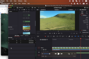
QuickTime is not just a media player but you can also use it to record videos. The default video format…
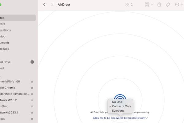
The issue of Airdrop not working on Mac may happen due to several factors such as network situation, airdrop discovery…


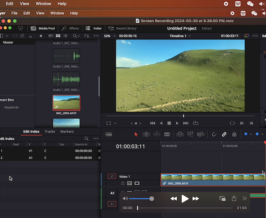
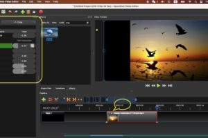
If you want to create some super clear videos, then you may need to use some 4k video editors. There…

The mouse is one of the most important devices for computers whether you are using windows, Mac or linux. There…


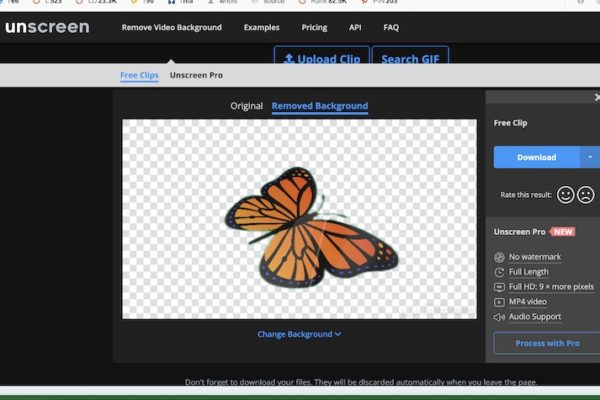
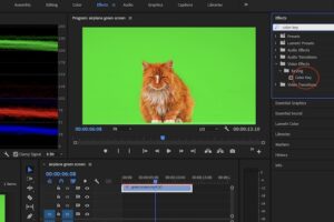
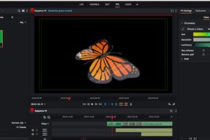
We know it is common to remove full video background online no matter you want to change the video background…
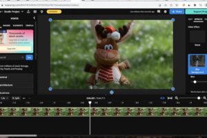
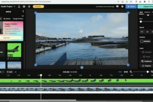
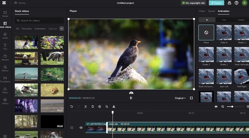
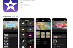
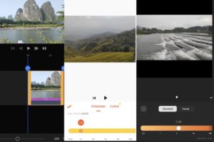
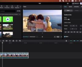
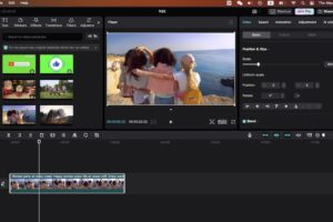
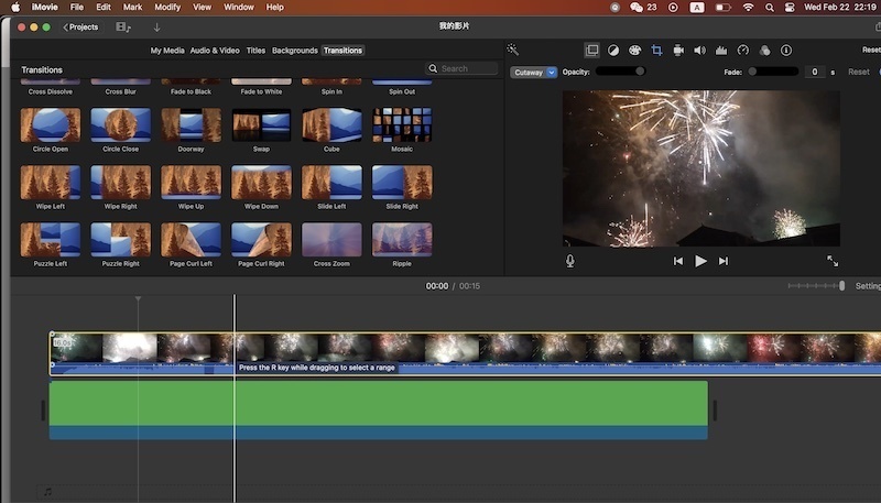
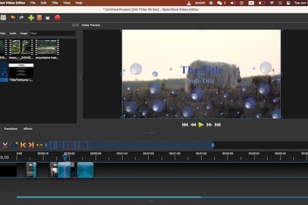
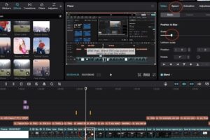
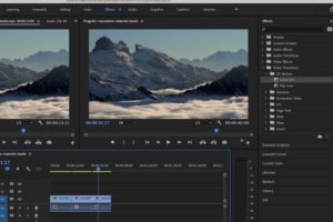
A proper video editing app helps you a lot to create some charming video clips. We know you may want…